Ann Shafer The end of a fair is always bittersweet. One is exhausted both physically and mentally, and yet, you want it to never end. The adrenaline is followed by such a let-down. If you’ve been following along, you know that I ran the Baltimore Contemporary Print Fair in its final three iterations (2012, 2015, 2017). For the first two of these I worked alongside the indomitable and amazing Ben Levy. He brought his remarkable brain, knowledge, and know-how to the enterprise. For the final iteration, I worked with the indefatigable and fabulous Morgan Dowty. Her quiet strength and constancy amazed me. And the fairs would not have happened without them. Thank you both. Running a fair is not for the faint of heart. But in the same way your love of a newborn baby makes you forget the pain of childbirth, the buzz of the fair long outlasts the exhaustion and sore feet. I always say it was the most fun part of the job. And I still mean it. It was an honor getting to know the dealers, publishers, and artists, just as it was meaningful to walk friends and collectors around and point out things I particularly liked both for me and for the museum’s collection. And that’s the great thing about prints, isn’t it? That one can have the same work of art that is in a museum collection. I love spreading the love. Today is the final day of these Curator’s Choice posts from the #LondonOriginalPrintFair, and while it takes a lot of work to select and gather the images and tombstone information (not to mention writing these mini-blurbs), its conclusion is bittersweet. I hope the cornucopia of images have inspired you to look more, buy something, make something. For that is always my goal: to engage an audience and show them the wonders of prints and printmaking. Until the next fair, this is your friendly print evangelist signing off. Please enjoy day 5/5 of offerings from the #LondonOriginalPrintFair. Today we finish up with R (Rebecca Hossack Art Gallery) through Z (Zuleika Gallery). Here is #LondonOriginalPrintFair Curator's Choice, 5/5. #prints #printmaking #printfair #curatorschoice #contemporaryprintmaking #contemporaryart #woodcut #relief #colorprints #printing #womenartists #collectart #artcollector #supportlivingartists #loveart #masterprinter #art #saga #societyofamericangraphicartists #nonobjectiveart #abstractart #londonoriginalprintfair #royalacademy #ifpda #etching #engraving #monotype #screenprint #lithograph #printevangelist #baltimorecontemporaryprintfair
0 Comments
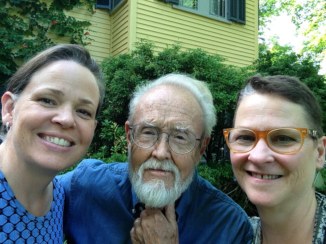
Ann Shafer As a curator, I instinctively judge the evenhandedness of any group of objects and assess how many of the works are by women artists, artists of color/BIPOC (a newish acronym meaning Black, Indigenous, People of Color), and queer artists. This is much more easily done with contemporary works. Old Master prints, as you know, are a whole other thing. The London fair gets fairly high marks for its gender inclusivity, but less so with racial diversity among the artists presented. I find it curious. And I have no answer as to why that might be. I’ll leave that right here for today. Please enjoy day 4/5 of offerings from the #LondonOriginalPrintFair. As always, these are presented alphabetically by dealer meaning the order is random, which I quite enjoy. Today we start with L (Loft 11 Gallery) and go through R (RAW Editions). Here is #LondonOriginalPrintFair Curator's Choice, 4/5. #prints #printmaking #printfair #curatorschoice #contemporaryprintmaking #contemporaryart #woodcut #relief #colorprints #printing #womenartists #collectart #artcollector #supportlivingartists #loveart #masterprinter #art #saga #societyofamericangraphicartists #nonobjectiveart #abstractart #londonoriginalprintfair #royalacademy #ifpda Ann Shafer It’s not that I don’t like lithographs. It’s that their flatness makes them, well, fall flat (see what I did there?). I mean, they are called planographic for a reason, right? Planographic printing means printing from a flat surface, as opposed to a raised surface or incised surface, like you get with intaglio (incised) and woodcut (relief). Maybe it’s because I don’t quite understand the chemical ins and outs of the process. It's magic. If asked, I respond with the oft-stated “it’s based on the principle that oil and water don’t mix.” Hardly a descriptive explanation. But, really, lithographs are totally cool because an artist can draw directly on the stone or aluminum plate (and can transfer a photographic image as well). The ability to produce a print that looks like a drawing is pretty darned awesome. There have been spectacular examples of lithographs since its invention by Alois Senefelder sometime in the 1790s. Great lithographs that pop to mind include Honoré Daumier’s Rue Transnonain, le 15 Avril 1834; Théodore Gericault’s Boxers, 1818; any poster by Alphonse Mucha or Henri de Toulouse-Lautrec; any lithograph by Käthe Kollwitz; New York scenes by George Bellows; regionalist scenes by Thomas Hart Benton and Grant Wood; New England scenes by Stow Wengenroth; any experiments by Robert Blackburn; and of course, Robert Rauschenberg’s Accident, 1963. But back to the cornucopia of prints offered at the London Original Print Fair. Please enjoy day 3/5 of selections from www.londonoriginalprintfair.com. Remember these are presented alphabetically by dealer meaning the prints will appear in a rather random order. Today we start with G (Gilden’s Art Gallery) and go through K (Kunstverket Galleri). Here is #LondonOriginalPrintFair Curator's Choice 3/5. #prints #printmaking #printfair #curatorschoice #contemporaryprintmaking #contemporaryart #woodcut #relief #colorprints #printing #womenartists #collectart #artcollector #supportlivingartists #loveart #masterprinter #art #saga #societyofamericangraphicartists #nonobjectiveart #abstractart #londonoriginalprintfair #royalacademy #ifpda Ann Shafer Recently, my friend Laura Albans challenged me to write about what I think makes a print great. In short, it came down to visual impact and emotional impact. Today, Laura asked me if I would name my favorite technique. If you’ve been following along, you know that I have looked at, researched, written about, and spoken about Stanley William Hayter and Atelier 17 for close to fourteen years. And you’ll know that Atelier 17 was primarily an intaglio studio. So there is your answer. I love a good scrumpy, tactile etching, engraving, drypoint, whathaveyou. I love the platemark mark. I love flipping a print over and seeing the back is just as interesting as the front. I love the objectness of them. I love the amount of planning, patience, and care they require. I love how the ink stands proud on the paper, the depth of the blacks, the variety of marks attainable through aquatint and softground etching. I love that they can be delicate and rough, crisp and feathery, light and dark. I love that in the inking of the plate one can vary the results so widely. Of all the techniques, it seems to me intaglio may well be the most versatile. After intaglio, I would have to go with relief. I love a good Durer apocalyptic woodcut, an expressionist print by Kirchner, Heckel, or Kollwitz, an elegant wood engraving by Asa Cheffetz or Clare Leighton, a linoleum cut by Charles White, or contemporary woodcuts by Chitra Ganesh, Yashua Klos, Tom Huck, or Raj Bunnag. Woodcuts seem so hale and hearty, and I love the strength and patience required in carving. I also love that they can be printed on a press, with a steamroller, or a wooden spoon. Please enjoy day 2/5 of offerings from the www.londonoriginalprintfair.com. Remember these are presented alphabetically by dealer meaning the prints will appear in a rather random order. Today we start with C (Clemens Büntig) and go through G (Gerrish Fine Art). Here is #LondonOriginalPrintFair Curator's Choice 2/5. #prints #printmaking #printfair #curatorschoice #contemporaryprintmaking #contemporaryart #woodcut #relief #colorprints #printing #womenartists #collectart #artcollector #supportlivingartists #loveart #masterprinter #art #saga #societyofamericangraphicartists #nonobjectiveart #abstractart #londonoriginalprintfair #royalacademy #ifpda Ann Shafer Oh my goodness gracious, just as I was finishing up my curator's choice posts from the #WestCoastPrintFair, another fair went live online. The London Original Print Fair offers sixty plus dealers and their inventories of terrific prints. In the face of all those wonderful prints, who am I to not do more posts. This is the first of five posts featuring works from the various dealers at the London fair, which I have never been to. That makes this online version so great. There are so many galleries here that don’t often come to the New York fairs. The dealers range from Old Masters to Contemporary; there is something for everyone. Please enjoy this first group of offerings from the www.londonoriginalprintfair.com. As was the case last week, these are presented alphabetically by dealer meaning the prints will appear in a rather random order. Today we start with A (Advanced Graphics) and go through C (CG Boerner). Here is #LondonOriginalPrintFair Curator's Choice, 1/5. #prints #printmaking #printfair #curatorschoice #contemporaryprintmaking #contemporaryart #woodcut #relief #colorprints #printing #womenartists #collectart #artcollector #supportlivingartists #loveart #masterprinter #art #saga #societyofamericangraphicartists #nonobjectiveart #abstractart #londonoriginalprintfair #royalacademy #ifpda Ann ShaferCome with me down a rabbit hole to where the praying mantis lives. We will look at a 1946 print by Fred Becker, who was one of Hayter’s people. He worked as a shop tech and printer at Atelier 17 in the 1940s until he left to found the printmaking program at Washington University in St. Louis. I have been looking at and researching this American artist recently; I have been mulling over Kaleidoscopic Organism, 1946, for longer then I’d like to admit. It has befuddled me. I thought today I would lay out my thinking and take you along for the ride as I pick it apart and attempt to get inside the artist’s mind. Please know this is only my thinking—no guarantee that any of it is right! Kaleidoscopic Organism is an engraving and etching (both hard and softground) and is sizable at 17 5/8 x 14 3/4 (plate size). The image is wacky. An amoeba-like mass occupies the center around which swirl discs that hold open said amoeba to reveal its innards. In the background are radiating lines that create either a halo or a vortex. Within the mass’ interior we find (from the bottom moving upward): a balustrade or railing that is being built or repaired, a casement window handle, a keyhole holding the center of the being but there’s something going through it (a little Dr. Seussian figure, n’est ce pas?), and assorted architectural wire forms surmounted by what I see as a praying mantis. Praying mantis, hmmm. These majestic but aggressive insects were a shared subject among artists making surrealist prints at Atelier 17. I’ve included several prints of mantes by Atelier 17 artists for your viewing pleasure. With angular rear legs, triangular pivoting head, bulging eyes, and large, weirdly human forearms, mantis anatomy translates easily into line and action on the plate and offers interesting stand-ins for humans. But more to the point, the female mantis devours the male mantis after copulation (yikes!). They are also known to attack other insects (delightful). [For a good discussion about the Surrealists’ obsession with praying mantes, see William L. Pressly, “The Praying Mantis in Surrealist Art,” The Art Bulletin 60, no. 4 (December 1973): 600–615. And Ruth Markus. “Surrealism's Praying Mantis and Castrating Woman.” Woman's Art Journal 21, no. 1 (2000), 33–39. So, what about that praying mantis in Becker’s organism? I think we’ve got ourselves a vagina dentata, reflecting myths about fierce lady bits and male castration fears. Becker’s form is not toothed like Hayter’s Ceres, 1947–48 (image below), but its head that is just at the apex of the cavity cannot be overlooked. I will leave it there. Then, we must look at the bulk of the organism itself. At its bottom we find two feet, one with a shoe so worn that a big toe pops out of it. Until this moment, I could still believe we were dealing with a microscopic look at teeming life or a celestial big bang in process, but the feet snap us back to the immediate, visible world. What the heck? Ok, so here are my theories/questions about each element, which often have opposing possibilities. They are many and still swimming around in my brain. I welcome any thoughts that may clarify or further confuse the issues. 1. Is the background radiating to highlight the subject like a halo or is it a vortex we might fall into? 2. Are the discs holding the form open or running around its edges? Are they swirling like wheels or symbolizing something else? I see variously eyes, lemon slices, stained glass windows, military medals of honor, kaleidoscope parts. But could they be railway car wheels or shower heads—you see where I’m heading here, don’t you? 3. The interior elements are structural, manmade, and mechanistic (even the mantis). They are linked together like a Rube Goldbergian contraption. What’s up with the balustrade, the keyhole, and those wire apparatuses? I find it curious that the exterior discs read as organic while the interior elements read as mechanistic. There is something there just out of reach, but it will come to me. 4. The feet read as either comical (a hobo or circus clown), or as deadly serious (a wounded or dead soldier). 5. The title cannot be overlooked: Kaleidoscopic Organism (although I hate it when artists rely on titles to explicate the work—shouldn’t it hold up on its own?). The dictionary tells us that a kaleidoscope can symbolize one’s escape in times of difficulty and self-doubt; that it constantly generates changing symmetrical patterns from small pieces of colored glass and therefore symbolizes anything that changes constantly. Here is where I’ve ended up on meaning in Kaleidoscopic Organism. The title and the aforementioned definition of kaleidoscope bring me to World War II and its aftermath. At first glance, the print (made in 1946, the year after the war ended) looks comical: those gargantuan feet, the toe poking out of the shoe, the whirligigs and deeley boppers. What a smart way to pull us in. But then the praying mantis at its core turns it dark; the radiant, glowing halo turns into a vortex; the feet become those of a dead soldier; the organisms holding open the form reveal man’s mechanistic world symbolizing war, its machines, and their enabling of unbelievable cruelty and death. I suppose that contemporaneous viewers might read this work more quickly, but I believe it is imperative that we know and learn from history. It also serves to remind us that when looking at a work of art, it must be considered in context since artists can never be disassociated from the time in which they are working. Becker’s print is still stewing in my brain. If I come up with a better answer, I’ll let you know. Fred Becker (American, 1913–2004) Kaleidoscopic Organism, 1946 Etching, softground etching, and engraving Plate: 451 x 378 mm. (17 3/4 x 14 7/8 in.) Annex Galleries Stanley William Hayter (British, 1901–1988) Cruelty of Insects, 1942 Engraving and softground etching Sheet: 230 x 288 mm. (9 1/16 x 11 5/16 in.); plate: 202 x 250 mm. (7 15/16 x 9 13/16 in.) Baltimore Museum of Art: Gift of Mr. and Mrs. Robert Paul Mann, Towson, Maryland, BMA 1979.367 Roderick Mead (American, 1900–1972) Praying Mantis, c. 1940s Engraving and softground etching Plate: 394 x 279 mm. (15 ½ x 11 in.) Smithsonian American Art Museum: Gift of Mrs. Roderick Mead, 1974.122.4 Werner Drewes (American, born Germany, 1899–1985) Praying Mantis, 1944, printed 1975 Engraving and softground etching Plate: 200 x 302 mm. (7 7/8 x 11 7/8 in.) Annex Galleries Clinton Blair King (American 1901–1979) Praying Mantis, c. 1945 Etching and aquatint Plate: 277 x 200 mm (10 7/8 x 7 7/8 in.) National Gallery of Art: Reba and Dave Williams Collection, Gift of Reba and Dave Williams, 2008.115.2866 Stanley William Hayter (British, 1901–1988) Ceres, 1947–48 Engraving, softground etching, and scorper Printed in black (intaglio), and yellow (screen, relief) 605 x 390 mm. (23 7/8 x 15 3/8 in.) Museo Nacional de Bellas Artes, Buenos Aires  Fred Becker (American, 1913–2004). Kaleidoscopic Organism, 1946. Etching, softground etching, and engraving. Plate: 451 x 378 mm. (17 3/4 x 14 7/8 in.). Annex Galleries.  Stanley William Hayter (British, 1901–1988). Cruelty of Insects, 1942. Engraving and softground etching. Sheet: 230 x 288 mm. (9 1/16 x 11 5/16 in.); plate: 202 x 250 mm. (7 15/16 x 9 13/16 in.). Baltimore Museum of Art: Gift of Mr. and Mrs. Robert Paul Mann, Towson, Maryland, BMA 1979.367.  Roderick Mead (American, 1900–1972). Praying Mantis, c. 1940s. Engraving and softground etching. Plate: 394 x 279 mm. (15 ½ x 11 in.) . Smithsonian American Art Museum: Gift of Mrs. Roderick Mead, 1974.122.4.  Werner Drewes (American, born Germany, 1899–1985). Praying Mantis, 1944, printed 1975. Engraving and softground etching. Plate: 200 x 302 mm. (7 7/8 x 11 7/8 in.). Annex Galleries.  Clinton Blair King (American 1901–1979). Praying Mantis, c. 1945. Etching and aquatint. Plate: 277 x 200 mm (10 7/8 x 7 7/8 in.). National Gallery of Art: Reba and Dave Williams Collection, Gift of Reba and Dave Williams, 2008.115.2866.  Stanley William Hayter (British, 1901–1988). Ceres, 1947–48. Engraving, softground etching, and scorper; printed in black (intaglio), and yellow (screen, relief). Plate: 605 x 390 mm. (23 7/8 x 15 3/8 in.). Museo Nacional de Bellas Artes, Buenos Aires. Ann ShaferHere’s another one that got away. And at my very last opportunity before leaving the museum, too. Rashaad Newsome’s 2016 set of lithographs were front and center in Tamarind’s booth at the 2017 Baltimore Contemporary Print Fair. The five lithographs are part of a larger project that begins with a performance of five dancers voguing, which was captured by an Xbox Kinect the artist reprogrammed. Five classic voguing dance forms were performed. The energetic swirls of their movements were captured digitally and subsequently translated into both sculptures and prints. Check out this video of Tornado Revlon. In the performance, each dancer—all of whom are well known in the voguing world—performs a different move: a catwalk is performed by Star Revlon; rapid hand movements are performed by Tornado Revlon; duck walking is performed by Justin Monster Labeija; spin dips are performed by Davon Amazon; and floor work is performed by Jamel Prodigy. For the Tamarind lithographs, the digitally tracked movements are printed in different colors, and a tiny plastic body part that indicates which part was tracked is collaged onto each print. They are 29 ¾ x 42 inches each. I knew they would both have wall power and draw people in. Newsome’s work looks at agency and privilege, asking who gets it, when, and why. Vogue balls, events that became widely known through the 1990 film Paris is Burning, is currently the subject of an FX series called Pose, which is streaming on Netflix, Amazon Prime, and elsewhere. I imagine that people in the voguing world have mixed feelings about being put under a microscope and portrayed by actors, particularly since vogue balls have always been recognized as safe spaces for Black and queer people. But that moniker “safe space” implies outsiders aren’t welcome. What do you do when Hollywood comes calling? Newsome’s performance regains agency for the performers themselves (Newsome is a part of the community) and brings it to the fine art world. Just as balls are safe spaces, I would postulate that artmaking is a safe space, too. In their need to investigate themes, problems, and ideas deeply, artists must have their own safe spaces where ideas are put through the conceptual sausage grinder and are transformed into something that starts conversations and spurs thinking and feeling. I like the parallels. You may recall I love the idea of taking dance/movement to the walls of a gallery (see my post about Trisha Brown). Works that cross disciplines have always interested me. But also because performance art is difficult to collect because of its ephemerality, I appreciate creative ways of capturing it. Just as Stan Shellabarger’s walking book (see earlier post) was the product of its own creation, Newsome’s prints capture performance through digital tracking technology. I am not particularly interested in performance art through documentary photographs. Newsome’s tracked movements translated into a jumble of frenetic energy are more evocative of the performance than any photograph could ever be. I thought it would be a great fit for the collection. Truthfully, I can’t recall which straw man quashed the acquisition. While I got used to disappointments over the years, I can still conjure the feeling of frustration. I used to always say: “I should have been a collector.” Oh well, guess I’ll just keep writing about it. Rashaad Newsome (American, born 1979) Published by Tamarind Institute FIVE SFMOMA, 2016 Five multi-color lithographs with 3D-printed and collage elements; and silver-leaf or pearlescent dusting Sheet (each): 29 3/4 x 42 inches Rashaad Newsome (American, born 1979) Published by Tamarind Institute Catwalk (Star Revlon), from the portfolio FIVE SFMOMA, 2016 Color lithograph with 3D-printed and collage elements; and silver-leaf or pearlescent dusting Sheet: 29 3/4 x 42 inches Rashaad Newsome (American, born 1979) Published by Tamarind Institute Hands (Tornado Revlon), from the portfolio FIVE SFMOMA, 2016 Color lithograph with 3D-printed and collage elements; and silver-leaf or pearlescent dusting Sheet: 29 3/4 x 42 inches Rashaad Newsome (American, born 1979) Published by Tamarind Institute Duck Walking (Juston Monster Labeija), from the portfolio FIVE SFMOMA, 2016 Color lithograph with 3D-printed and collage elements; and silver-leaf or pearlescent dusting Sheet: 29 3/4 x 42 inches Rashaad Newsome (American, born 1979) Published by Tamarind Institute Spin Dips (Davon Amazon), from the portfolio FIVE SFMOMA, 2016 Color lithograph with 3D-printed and collage elements; and silver-leaf or pearlescent dusting Sheet: 29 3/4 x 42 inches Rashaad Newsome (American, born 1979) Published by Tamarind Institute Floor Performance (Jamel Prodigy), from the portfolio FIVE SFMOMA, 2016 Color lithograph with 3D-printed and collage elements; and silver-leaf or pearlescent dusting Sheet: 29 3/4 x 42 inches  Rashaad Newsome (American, born 1979). Published by Tamarind Institute. FIVE SFMOMA, 2016. Five multi-color lithographs with 3D-printed and collage elements; and silver-leaf or pearlescent dusting. Sheet (each): 29 3/4 x 42 inches.  Rashaad Newsome (American, born 1979). Published by Tamarind Institute. Catwalk (Star Revlon), from the portfolio FIVE SFMOMA, 2016 . Color lithograph with 3D-printed and collage elements; and silver-leaf or pearlescent dusting. Sheet: 29 3/4 x 42 inches.  Rashaad Newsome (American, born 1979). Published by Tamarind Institute. Hands (Tornado Revlon), from the portfolio FIVE SFMOMA, 2016 . Color lithograph with 3D-printed and collage elements; and silver-leaf or pearlescent dusting. Sheet: 29 3/4 x 42 inches.  Rashaad Newsome (American, born 1979). Published by Tamarind Institute. Duck Walking (Juston Monster Labeija), from the portfolio FIVE SFMOMA, 2016. Color lithograph with 3D-printed and collage elements; and silver-leaf or pearlescent dusting. Sheet: 29 3/4 x 42 inches.  Rashaad Newsome (American, born 1979). Published by Tamarind Institute. Spin Dips (Davon Amazon), from the portfolio FIVE SFMOMA, 2016 . Color lithograph with 3D-printed and collage elements; and silver-leaf or pearlescent dusting. Sheet: 29 3/4 x 42 inches.  Rashaad Newsome (American, born 1979). Published by Tamarind Institute. Floor Performance (Jamel Prodigy), from the portfolio FIVE SFMOMA, 2016. Color lithograph with 3D-printed and collage elements; and silver-leaf or pearlescent dusting. Sheet: 29 3/4 x 42 inches. Ann ShaferRecently I was google-alerted to an ARTNews article about the Baltimore Museum of Art’s recent round of contemporary acquisitions, which, during its “year of the woman,” are all by women, mostly of color. Most of the artists are likely unfamiliar to you—they were to me. Let me be clear: I applaud the effort; it’s all good. But it made me think back to all the acquisitions meetings during which I proposed works of art only to be turned down because the artists were unknown to my colleagues. That reason to say no, “I’ve never heard of them,” made me mentally design a pie chart. There is a narrow slice of pie that represents contemporary artists my colleagues were interested in, and then there is the rest of the pie filled with artists making meaningful work. They just aren’t represented by Hauser & Wirth, Gagosian, or David Zwirner. I once was told: “There is a difference between contemporary art and art made today.” I always felt this was seriously shortsighted. This points to the beauty of prints and other works on paper since they are considerably more affordable than paintings, sculpture, installations, video art, and such. The price point of paintings, etc., is often a stretch for all but the best endowed museums, and the ability to acquire these kind of objects is limited. Whereas the curators in these areas must choose VERY carefully, curators of works on paper have it easier in collecting outside the sliver of pie that the contemporary curators are held to. The print curator is always thinking about the content and usefulness of a particular object rather than whether it’s by a superstar artist (at least I am). Over the years, there have been quite a few works I failed to get into the collection. I have never forgotten them. One of the ones that got away was close enough that we brought it into the museum for consideration. (Usually if it was a no, the no came long before we brought works in.) It was a portfolio of prints by Damon Davis called All Hands on Deck, 2015. Here’s the backstory. Davis is a native of East St. Louis. Following the death of Michael Brown in Ferguson, Missouri, on August 9, 2014, and events that followed—peaceful protests that turned ugly—Davis took photographs of the hands of a variety of protesters up, in a turnabout of gesture. Rather than hands up as surrender, they are hands up in protest. The photographs were printed out on large sheets and wheat pasted onto the boarded-up storefronts along West Florissant Avenue (with the permission of the store owners), which had become ground zero of the protests. Subsequently, Davis worked with Wildwood Press’ Maryanne Simmons to create a fine art edition of seven pairs of hands. The moment I saw the announcement of its publication, I fired off an inquiry about the portfolio. It seemed like a no-brainer for the Baltimore Museum given the city’s unrest following the death of Freddie Gray in April 2015, less than a year after Michael Brown’s death. Talk about parallels. (Susan Tallman wrote an excellent article on Davis’ portfolio in Art in Print, which you can find here.) When the prints arrived, my colleagues took issue with the quality of the images. Davis had retained the pixilation and choppiness of the edges from the wheat paste posters. I explained that Davis had photoshopped the images quickly in an effort to get them up on storefronts and had decided to retain that same look in the fine art edition. I had absolutely no doubt that they would look fantastic on the wall—in curator parlance we would say they have wall power. Even better, they are both specific to Ferguson and universal. They stand as a monument to protests against police brutality across the country and they are as powerful today as they were in 2015. I regret my failure for the collection. And even worse: we had full funding for the portfolio from a donor. Damon Davis (American, born 1985) Published by Wildwood Press All Hands on Deck, 2015 Portfolio of seven lithographs Sheet (each): 813 x 1232 (32 x 48 ½ in.)  Damon Davis (American, born 1985), published by Wildwood Press. All Hands on Deck, 2015. Portfolio of seven lithographs. Sheet (each): 813 x 1232 (32 x 48 ½ in.).  Damon Davis in Ferguson, MO, with wheat-pasted posters.  Damon Davis' wheat-pasted posters in Ferguson, MO, 2014.  Wildwood Press' booth at the Seattle Art Fair.  Damon Davis' portfolio on view at the Mitchell Museum at Cedarhurst, 2016. Ann ShaferA spirit of collaboration and experimentation was at the heart of Atelier 17. Prints by Hayter and his associates are conceptually and passionately full of ideas about the human condition, dreams, mythology, war, and natural phenomena. The exceptional rigor of subject matter in these images was achieved by means of three technical innovations, which changed the course of twentieth century printmaking. First, Hayter revived the art of engraving, which he believed was uniquely suited to address issues of modern art. (Historically engraving had been used to reproduce more famous works for a large market.) Second, members of the studio pioneered the use of textiles, paper, string, wood, and other materials pressed into a softground-coated plate to gain an amazing variety of textures. Third, Hayter and his colleagues (credit to Krishna Reddy and Kaiko Moti) developed several inventive methods of printing in colors from a single plate, eliminating the need to print separate plates for each color. All of these are counterintuitive to admirers of traditions intaglio prints. While looking at the works from this studio, know that often when you think you are seeing etching, it is actually engraving. When you think you are seeing aquatint, it is really softground etching. When you see a color print, it is not the result of each color being printed from separate plates, but of being applied to a single plate. Today’s post zooms in on the second element, softground etching. Not a new technique by any means, the possibilities were greatly expanded by one of the women artists working at Atelier 17, Sue Fuller, who used bits of fabric that went beyond a simple pattern like pantyhose used to create tonal passages mimicking aquatint. Rather, she utilized lace and pieces of string to create the subject of the image itself. Fuller’s print Hen, 1945, is the clearest example of this in its use of a lace collar to form the hen. Fuller’s Cacophony, 1944, features several standing female figures, which are delineated by string. Fortunately for us, Fuller also created collages of some of her compositions, including the one for Cacophony, which is currently “on view” in an online exhibition from Susan Teller Gallery. Seeing the collage of string in the same composition really brings it together and enables viewers to imagine what is meant by softground etching. Teller also is showing the first state and the final, all of which makes clear the composition’s creation. Susan Teller is the go-to person for works by Fuller. Her breadth of knowledge and depth of stock by Fuller and others who worked at the Atelier during its New York years is legendary. The online exhibition is here. For a superb read on Sue Fuller and the many female artists working at Atelier 17, look no further than the recently published book by Christina Weyl, The Women of Atelier 17: Modernist Printmaking in Midcentury New York (Yale University Press, 2019). Christina’s accomplishment with her book is tremendous and it is required reading for students of this era. Yesterday, Joanne B Mulcahy published a review of Christina’s book for Hyperallergic, beautifully summing up its contents. I suspect there may be a run on the book from online sources; I suggest if you are thinking a procuring a copy, act fast. Sue Fuller (American, 1914–2006) Hen, 1945 Engraving and softground etching Sheet: 458 x 364 mm. (18 1/16 x 14 5/16 in.) Plate: 378 x 299 mm. (14 7/8 x 11 3/4 in.) Baltimore Museum of Art: Gift of Adelyn D. Breeskin, BMA 1948.52 Sue Fuller (American, 1914–2006) Cacophony, 1944 Collage 11 x 8 inches Susan Teller Gallery, New York (courtesy the Estate of Sue Fuller and the Susan Teller Gallery, New York) Sue Fuller (American, 1914–2006) Cacophony (first state), 1944 Softground etching, 11 x 8 inches Susan Teller Gallery, New York (courtesy the Estate of Sue Fuller and the Susan Teller Gallery, New York) Sue Fuller (American, 1914–2006) Cacophony (final state), 1944 Etching, softground etching, and aquatint 11 x 8 inches Susan Teller Gallery, New York (courtesy the Estate of Sue Fuller and the Susan Teller Gallery, New York)  Sue Fuller (American, 1914–2006), Hen, 1945, engraving and softground etching, sheet: 458 x 364 mm. (18 1/16 x 14 5/16 in.), plate: 378 x 299 mm. (14 7/8 x 11 3/4 in.), Baltimore Museum of Art: Gift of Adelyn D. Breeskin, BMA 1948.52  Sue Fuller (American, 1914–2006), Cacophony, 1944, collage, 11 x 8 inches, Susan Teller Gallery, New York (courtesy the Estate of Sue Fuller and the Susan Teller Gallery, New York)  Sue Fuller (American, 1914–2006), Cacophony (first state), 1944, softground etching, 11 x 8 inches, Susan Teller Gallery, New York (courtesy the Estate of Sue Fuller and the Susan Teller Gallery, New York)  Sue Fuller (American, 1914–2006), Cacophony (final state), 1944, etching, softground etching, and aquatint, 11 x 8 inches, Susan Teller Gallery, New York (courtesy the Estate of Sue Fuller and the Susan Teller Gallery, New York) Ann ShaferIn 2017, the museum held what is likely to be its last Baltimore Contemporary Print Fair (BCPF). The fair ran at the museum beginning in 1990 (the brainchild of Jay Fisher and Jan Howard), and the proceeds generated enabled the purchase of many prints for the collection. From the final fair, we made a handful of acquisitions, including several that I’ve written about previously. Another of those works is this print by Sascha Braunig executed at Wingate Studio, which is headed by Peter Pettengill. Not only is Peter a consummate printer, but also he and son James and daughter-in-law Alyssa are just about the nicest people you will ever meet. The work they brought to BCPF was always timely, beautifully executed, and exciting. And their sales pitches were also on point. I was honored to include them in the fair over the years. Braunig’s subject is the human body (usually female and usually in paintings and sculpture) portrayed in a reductive but potent manner. In this print, the female figure is formed by metal-looking tubes that mimic a coat rack or corset stays (hence the title). Across the width of the image area is stretched her undergarments, which are delightfully mismatched and totally relatable. But it’s hard to know if the undergarments are effective in any way. They look like they are supporting and shielding the figure but are not really being worn. This confusion fades as one notices that the profile face of the figure is draped over the pink top in a gesture of defeat or resignation. And, just as you begin to make sense of the image, suddenly you notice that the tubes crisscross each other in an impossible way behind her eyes. For me, it comes across as a woman who is dependent on and trying to escape the confines of the stays. The push-pull tension of the piece grows as you spend more and more time engaged with it. In the end, her weariness seems a perfect metaphor for these days of social distancing and this disastrous pandemic. Sascha Braunig (Canadian, born 1983) Printed and published by Wingate Studio Stays, 2016 Four plate aquatint etching with burnishing, soft ground, and sugar lift Sheet: 988 × 711 mm. (38 7/8 × 28 in.) Plate: 733 × 481 mm. (28 7/8 × 18 15/16 in.) Baltimore Museum of Art: Women's Committee Acquisitions Endowment for Contemporary Prints and Photographs, BMA 2017.69  Ann ShaferI’ve been teaching myself Adobe’s video editing software, Premiere Rush. Today is the debut of my first attempt, a very short video on Stanley William Hayter’s Rue des Plantes, 1926. For our epic research trip to Paris in 2015, Ben Levy, Tru Ludwig, and I had a lot on our to-do list related to the Hayter exhibition. First on the list was to photograph and film the printing of Hayter’s Torso, 1986, at Atelier Contrepoint, which I wrote about in another post. Second was to interview Désirée Hayter on video. Third was to find and photograph as many locations of the Atelier as possible (it moved a bunch of times). And fourth was to find, photograph, and videotape the locations that appear in Hayter’s series Paysages urbains, 1930 (more on that in another post). While doing the last, I added finding the site of Rue des Plantes to the list. Rue des Plantes is a lovely early drypoint by Hayter depicting a simple street scene in the 14th arrondissement. In it a lone figure carrying her daily market purchases walks toward a building that oddly is situated in the middle of a cobblestone street. Finding the site wasn’t too hard, but finally laying our eyes on it sparked our adrenaline. Ben set up the video equipment intent on taking some B-roll for an eventual video for the exhibition website. With the camera rolling, suddenly an older woman carrying her market purchases wandered into the frame. The three of us must have looked like lunatics gesturing to each other madly but silently so as not to be recorded on the tape. It couldn’t have been more perfect. Finally, I’ve pulled a short video together showing this golden moment, which thrills me still. Stanley William Hayter (English, 1901–1988) Rue des Plantes, 1926 Drypoint Sheet: 400 x 328 mm. (15 3/4 x 12 15/16 in.) Plate: 267 x 208 mm. (10 1/2 x 8 3/16 in.) Baltimore Museum of Art: Bequest of Ruth Cole Kainen, Chevy Chase, Maryland, BMA 2011.263  Ann ShaferI’m a super fan of intaglio printmaking—intaglio refers to printmaking techniques in which the image is incised into a surface and the incised line or sunken area holds the ink—and I always wanted to do a series of shows on techniques, starting with, of course, intaglio. (Sorry folks, lithography would be last; well, maybe screenprinting.) Stanley William Hayter was a great practitioner of intaglio printmaking, as were all of the artists who worked with him at Atelier 17. Many of them established or ran university printmaking departments, including Gabor Peterdi, who taught at Yale from 1960 to 1986. One of Peterdi’s students was Peter Milton, who must stand as one of the great intaglio printmakers of the latter part of the 20th century. The BMA has a handful of Milton’s prints. One of the most spectacular, Interiors IV: Hotel Paradise Café (1987), is mindblowing for students in MICA professor Tru Ludwig's History of Prints classes. Upon its unveiling one would hear choruses of “wow!” along with mutters of “it’s so not fair.” Its intricacies have both inspired and depressed young printmakers. Tru and I are both fans and when we had the opportunity to hear Milton speak at Jane Haslem’s Washington, D.C., gallery, we jumped at the chance to meet him. After the talk we approached and he and Tru bonded over everything from techniques to history to all the esoteric details that appear in his prints. It was also there that I spied one of his drawings for his series The Aspern Papers, which I eventually acquired for the BMA—more on that in another post. During their conversation, Peter told Tru that he considered the copper plates to be the most beautiful things he makes. The lightbulb went off and the next thing we knew, Tru and I were working together with James Archer Abbott, then director of Evergreen Museum and Library, to curate an exhibition of Milton’s plates, prints, and preparatory drawings. Several trips were made to Milton’s New Hampshire studio and home, where we were welcomed by Peter and his lovely wife, Edith. There we got to interview him, see where the magic happens, and select the plates and other works to be included in the show. To my mind, Milton’s Interiors series is his most important. We included five of the seven plates from that series including The Train from Munich (1995), which focuses on Edith’s 1939 departure from Germany as one of 10,000 children sent on a Kindertransport train taking unaccompanied Jewish children to the United Kingdom for the duration of the war. [Edith and her sister lived with a British family for seven years and she eventually published an excellent memoir about that time called Tiger in the Attic (a NYT review is here: https://bit.ly/MiltonTigerinAttic).] The Train from Munich graces the cover of the catalogue produced for the Evergreen show and it is written about in depth therein. The link to the PDF catalogue is here: https://bit.ly/MiltonCatalogue. Working on the show, I think Tru had the most fun job. He was the muscle responsible for polishing the copper plates. This is no easy task and takes patience and perseverance. In the end, we both agree with Peter. The copper plates are stunningly beautiful and reveal things, objects, and moments that are easily missed in the printed versions. It was an honor to work with this titan of printmaking. And, we owe one last thank you to Jim Abbott for letting us make a dream come true. Ann ShaferWhen the museum acquired Chitra Ganesh’s work, I already had the seed of a show growing in my mind. I had been asked to come up with an exhibition drawn from the collection featuring works by artists of color. This is problematic on many levels. I have always believed that separation is sometimes useful, but that integration must be the goal. In any case, the works available for a show of that sort lacked any thematic cohesion. At the same time, I’d had many MICA students inquire about seeing works from the storeroom that reflected a graffiti or comic book sensibility. The collection did not have much to offer. It took time and several acquisitions to bring together an exhibition that focused on the theme of alternate realities—artists looking at real-world problems through visual fantasies, comics, sci-fi. Ganesh’s gorgeous print fit the bill beautifully and was installed along with prints by Trenton Doyle Hancock, Wangechi Mutu, Toshio Sasaki, Enrique Chagoya, William Villalongo, iona rozeal brown, Raymond Pettibon, and Amy Cutler. On Paper: Alternate Realities was on view September 21, 2014–April 12, 2015. It was the most organically diverse show of my career and remains one about which I feel extremely proud. I love a print that looks cool and asks more questions than it answers. Chitra Ganesh’s Away from the Watcher is a colorful combination of screenprint and woodcut that features an enigmatic figure at left (in a scuba or space suit—you decide) who seems to be exhaling an Indian goddess figure, while watching a city on a hill possibly being destroyed. Along the top left is a comic-strip-style thought bubble that reads: “She taught me precious little before she withered and died. Nothing of the little black holes I would dip into. Nothing of telepathy, nor the insides of my eyes. Nothing of…” This image raises many questions: Is somebody inside the scuba/space suit—isn’t it propped up? Is the Indian goddess figure being expelled or inhaled? Are we underwater or in outer space? What do the small winged creatures signify? What calamity has befallen the city at right? The somber melancholy of the text seems at odds with the dynamic depiction of the planet’s fissures, as well as the brilliant color and energetic comic-book style of representation. These alternate moods and narratives clash and connect in a newly constructed vision of the future. Chitra Ganesh (American, born 1975) Printed and published by Durham Press Away from the Watcher, 2014 From the series Architects of the Future Woodblock and screenprint 629 × 797 mm. (24 3/4 × 31 3/8 in.) Baltimore Museum of Art: Purchased as the gift of an Anonymous Donor, BMA 2014.29  Ann ShaferFile this post under nothing lasts forever, even on the interwebs. For the BMA's 100th birthday, staff produced 100 blog entries on favorite collection objects. Some were videotaped pieces featuring curators, conservators, and other staff speaking on camera; other entries were written posts. I went to look for my written pieces on artbma.org and couldn't find them anywhere (thankfully, the videos are still on YouTube). Thanks to Laura Albans, I have recovered the text for my entry on Dürer's Knight Death and the Devil, portions of which I share here. The best part of working in a large collection of prints, drawings, and photographs is the range of material. I used to always say that you could come up with almost any theme and find an entire exhibition on it drawn out of the solander boxes. Since my interests tend toward the 20th and 21st centuries, it may surprise some of you, then, that Albrecht Dürer’s Knight, Death and the Devil is one of my favorite prints of all time. Not only is it a glorious example of engraving, but also it carries a universal message to stand by the courage of your convictions. Albrecht Dürer was a German printmaker, draftsman, painter, observer of nature, and humanist. In 1513 and 1514 he created a trio of engravings that have come to be called his master prints. In addition to Knight, Death and the Devil, the trio includes St. Jerome in His Study and Melencolia I. Most scholars agree that the former represents the active life, while the two others represent the intellectual life and the contemplative life respectively. While the three prints together are spectacular, I’m most drawn to Knight, Death and the Devil. The image is a visual feast. It features a righteous German knight resplendent in armor, a horse straight out of Renaissance Italy, a wonderful and faithful companion Fido the dog, and gnarly creatures representing Death and the Devil, all set in a naturalistic landscape. Contemporaries of Dürer would have understood the symbolism of every aspect of this print. But our own unfamiliarity with those symbols doesn’t lessen the impact of the work. Clearly this stalwart fellow is making his way through the forest of temptation and vanitas. He is able to keep to his path, ignoring all that is going on around him and stands by the courage of his convictions. Even if we strip the image of its religious associations of pre-reformation Catholicism, the message of perseverance is clear. Stick to your guns, well, lance, and you can get through anything with grace and dignity. A message as important today as ever. Albrecht Dürer (German, 1471-1528) Knight, Death and the Devil, 1513 Engraving Sheet (trimmed within platemark): 244 x 187 mm. (9 5/8 x 7 3/8 in.) Baltimore Museum of Art: Gift of Alfred R. and Henry G. Riggs, in Memory of General Lawrason Riggs, BMA 1943.32.188 This image is less than stellar, serving as an excellent reminder that it's always better to see works like this in person.  Ann ShaferYou might be surprised to learn that Hayter's workshop is still operating in Paris at 10, rue Didot. After his death in 1988, the workshop changed its name to Atelier Contrepoint and is run by Hector Saunier, who printed many of Hayter’s late compositions. I was fortunate to be able to visit the Atelier twice, in 2014 and 2015. The first time was to meet Hector and see what the operation looked like. The second time Hayter's widow, Désirée, agreed to bring over one of his plates so Hector could ink and print it for us (there is no one better suited for this particular task). The plan was to create an online feature for the exhibition’s web site, which never happened because the show was cancelled. As usual, Ben Levy and Tru Ludwig were with me, and between the three of us, we shot a lot of video and photographed Hector and Shu-lin Chen printing Hayter’s Torso, 1986. Désirée couldn’t find the plate she was originally thinking of, so she randomly selected Torso, which turned out to be serendipitous because Torso conceptually circles back around to the fist clenching the void discussed in an earlier post. In Torso, Hayter used stripes with inverted color variants, inking the central intaglio composition in green, red, and fluorescent orange, and with a horizontally rolled gradient of blue/yellow/green. The shape of the torso is defined by a mask that was laid down on the inked plate, blocking the rollers from depositing the blue, yellow, and green ink on the paper, producing an area of white across the center. The positive shape of the torso, described by an absence, echoes the conundrum of the untitled plate six from The Apocalypse, in which the negative space of a clenched fist is described by a positive volume. In this late print, the cognitive inquiries and accumulated techniques of four decades have come together. With the copper plate under her arm, we met Désirée on the appointed day at Atelier Contrepoint. After consulting the catalogue raisonné, they got right to work. Shu-lin set about inking the plate (intaglio) in red, fluorescent orange, and dark green in vertical stripes. Hector prepared the rainbow roll of blue, yellow, and green on a glass palette. The mask was still wrapped with the plate, so it was used as well. When Shu-lin was satisfied with her wiping job, the plate was ready for the mask’s placement and the rainbow roll. Hector completed his part and the plate was placed on the bed of the press that had been used for thousands of prints by hundreds of artists over the majority of the twentieth century. After a few unsatisfactory pulls, they printed four impressions, one of which eventually entered the Baltimore Museum of Art’s collection. I remain amazed that I got to experience the printing of one of Hayter’s plates and so appreciative of Désirée, Hector, and Shu-lin’s generosity that day. Even better, Ben Levy and Tru Ludwig were with me to witness the magic. Ann ShaferIn my previous post I talked about Stanley William Hayter's 1959 open bite etching Cascade and promised to dig into its making. It takes many images to describe the process of simultaneous color printing, so I created a PDF slide deck to illustrate how Ben Levy, Tru Ludwig, and I made a group of test prints to figure it all out. You can find the PDF here:
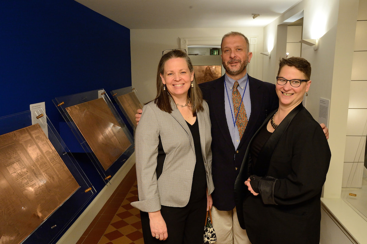
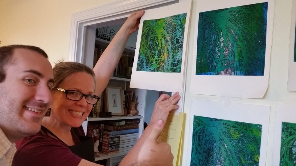
Ann ShaferCascade, 1959, by Stanley William Hayter, is the print I planned to use of the cover of the catalogue. One, because it's gorgeous. Two, because by 1959, Hayter is 58 and had been at it for more than thirty years and Cascade sums up so much of Hayter's thinking. During that time, he's helped Spanish refugees during the Spanish Civil War by hiding them in the studio; he's dropped everything and fled Paris as it went to war with Germany in 1939; he's created something really special in NY during the war and following (he's in NY from 1940-1950); he's watching his 16-year-old son die in 1946; he's helped hundreds of artists find their voices and discover new ways of creating intaglio prints; he, like so many other artists, has grappled with the horrors revealed by the Holocaust and bombing of Hiroshima and Nagasaki; and he's been able to return to France and purchase a vacation home in the south of France. But Hayter was also a man who never stopped thinking, working, creating, loving, living. Three, it's a great place to start talking about one of the Atelier's most important discoveries, that of simultaneous color printing (sometimes called viscosity printing, although Hayter didn't like that term since all inks have a viscosity of some sort). Cascade, 1959, is a colorful print with an all-over composition that appears completely abstract; seemingly random drips and gestures cover the plate. Hayter, however, never accepted pure abstraction as a meaningful subject—even when his subjects defy conventional representation, his titles anchor them in the world of places and things. Cascade is one of many works inspired by the appearance of rushing water in a river near his home in the south of France. The direct autographic drawing that had been essential to Hayter’s work since he began engraving has disappeared, replaced by a variety of devices that could be set in motion by his hand, but whose outcomes were far more open to chance: leaking cans of liquid ground suspended as pendulums, and marker pens that could dribble and spray showers of thin resist. These systems recorded, rather than depicted, the behavior of liquids in motion. Cascade is an indexical print (see prior post about Trisha Brown). Despite all of the scholarly reasons we can cite for Hayter's switch from engraving lines to depict images to indexical splashes of liquid, I've always wondered if his hands were just tired and he was dealing with an onset of arthritis. I have absolutely no proof of this--it's just a thought. What's so intriguing to me about the print is figuring out how in the world a bunch of open-bit swooshes and gestures are inked to produce the colorful image. First, we need to understand that to produce a color print, normally one would create separate copper plates for each color and they would be printed in successive layers on the paper in multiple passes through the press. Instead, Hayter layered the different colors on the same, single plate, and ran it through the press once. The trick is to vary the amount of oil in each color so that they don't run together as they are applied. (This idea was developed at the Atelier by Krishna Reddy and Kaiko Moti--an example of the collaborative nature of the workshop.) Along with the print itself, I'm including an image of the zinc plate (also in Baltimore's collection, a gift from Mrs. Hayter, BMA 2014.40), and an image that shows the cross section of the plate in the order it is inked. I hope this will make some sense; we'll dig in more tomorrow. First, the plate is wiped intaglio in black so that the ink clings to the canyon walls; second, a soft roller carrying the rainbow roll of blue/pink/blue deposits color in the canyons; third, a hard roller deposits an unblended green and yellow across the plateau. This will all be made clearer tomorrow when I share the test plates we created for the exhibition to show each step in this inking process. Because these test plates are the first and only etchings I've ever made, you can imagine I had help. I am deeply, supremely indebted to Tru Ludwig and Ben Levy, who made it all happen. Tomorrow you'll see us in action. Stanley William Hayter (English, 1901-1988) Cascade, 1959 Open bite etching; printed in black (intaglio), blue-pink-blue gradient (relief), yellow, green, and blue, unblended (relief) Sheet: 794 x 584 mm. (31 1/4 x 23 in.) Plate: 489 x 489 mm. (19 1/4 x 19 1/4 in.) The Baltimore Museum of Art: Purchased as the gift of the Print, Drawing & Photograph Society, BMA 2008.112   Ann ShaferIn the previous post I shared a video about Stanley William Hayter (known as Bill to his friends), an artist that has interested me for many years. I also shared a link to a PDF catalogue for an exhibition that took place last year in São Paolo, Brazil. I was lucky enough to participate in a conference there in conjunction with that exhibition, Atelier 17 and Modern Printmaking in the Americas. I’m sharing a summary of the conference I wrote for another publication that I hope you find interesting. And, if you or any of your students need a dissertation topic, read through to the end. The conference was held at the Museu de Arte Contemporãnea, which is part of the University of São Paolo and is known as MAC USP. Both the exhibition and conference focused on printmaking and artistic exchange between the United States and South American countries in the mid-twentieth century. The exhibition, catalogue, and conference were born out of the research of USP graduate student Carolina Rossetti de Toledo, who, under the supervision of professor and chief curator Ana Gonçalves Magalhães, focused on several gifts to São Paolo’s new Museum of Modern Art (MAM) in the 1950s of prints from Nelson Rockefeller, Henry Ford, and Lessing Rosenwald (the majority of MAM’s permanent collection was transferred to MAC USP upon its founding in 1963). Nelson Rockefeller made two gifts, one in 1946 of paintings and sculpture and another in 1951 of twenty-five modern prints, to assist in the establishment of a museum of modern art in São Paolo. (He also donated a group of paintings to a museum in Rio de Janeiro in 1952.) Rockefeller’s interest in Brazil began when he travelled there as the director of the Office of the Coordinator of Inter-American Affairs, the purpose of which was to strengthen relations with Latin America during World War II, both politically and culturally. The initial selection of prints for the Rockefeller donation was made by MoMA curator William Lieberman, who chose prints that represented cutting-edge modernism. The majority reflect American printmaking of the time, meaning works by artists associated with Stanley William Hayter’s Atelier 17. Why Rockefeller focused on MAM in São Paolo specifically remains unclear. Whatever the real reason, it was noted as a “gesture of goodwill.” A selection of prints from the 1951 gift were exhibited that year in São Paolo but have rarely been shown in the intervening years. Following Rockefeller’s gesture, Henry Ford donated one print in 1953, and Lessing Rosenwald made a gift of nine modern prints in 1956, which were meant to augment the collection in the area of international modernism. The connection between the three donors and what motivated the Ford and Rosenwald gifts is unclear. But among the prints in these later gifts were yet more examples of international modernism in the form of works by artists associated with Atelier 17. For Brazilian artists, there were three possible points of contact with Atelier 17. The first was through trips abroad. The second was through the publication and circulation of books by Hayter and his associates. The third was through exhibitions such as MoMA’s 1944 Atelier 17 exhibition, which traveled not only around the United States but also throughout Latin America, and through the exhibitions of works by Atelier 17 artists in the São Paolo Biennials and other venues. Hayter had an exhibition in Rio de Janeiro in 1957, which also traveled to Buenos Aires, and his work was included in the British pavilion in the 1959 São Paolo Biennial (MAM purchased several prints from this show). Interestingly, Atelier 17 artist Minna Citron had an extensive one-person show at MAM in São Paolo in 1952, which was by far the biggest exposure of an Atelier 17 artist in Brazil up to that point. Citron was fairly proficient in Portuguese (and many other languages), which may account for how she secured and coordinated this show. Several of the prints in the Rockefeller gift to MAM had been shown in other impressions in the 1944 MoMA exhibition and yet other prints in the gift were seen in Una Johnson’s seminal National Print Annual exhibitions at the Brooklyn Museum. In other words, the gift was of cutting-edge contemporary prints. There are still gaps in the story, however. In her essay for the exhibition catalogue, Rossetti de Toledo notes, rightly, that the connections between modern American and European printmaking and its Latin American counterparts are not well understood or properly documented. The Rockefeller gift is one piece of the puzzle. Rossetti de Toledo’s research into the Rockefeller gift developed into the MAC USP exhibition and bilingual catalogue, both majorly supported by the Terra Foundation. In addition to prints from MAC USP’s collection, the exhibition featured loans from the Terra Foundation’s extensive collection of American prints and works from the Brooklyn Museum and Art Institute of Chicago. The conference began with introductory remarks from Magalhães and Terra Foundation curator Peter John (PJ) Brownlee. Rossetti de Toledo spoke about her research on the Rockefeller gift. I introduced Hayter and the Atelier 17, setting the stage for the discussion. Other speakers included Luiz Claudio Mubarac, who gave an overview of Brazilian printmaking in the twentieth century; Silvia Dolinko, who gave an overview of printmaking in her home country of Argentina; Heloisa Espada, who focused on Brazilian artist Geraldo de Barros (he worked at Atelier 17 in Paris in 1951); and Priscila Sacchettin, who spoke about Livio Abramo (he worked at Atelier 17 in 1951–52 and his work appears in Hayter’s book, About Prints). Christina Weyl closed out the conference with her talk on women at Atelier 17, which was an excellent preview of her important, recently published book. Over the course of two days, it became clear that South American printmaking runs in sometimes intersecting but separate tracks from European and American art. While artists cross pollinated through travel, books, and exhibitions, for those of us who study prints, there’s a whole other world of printmakers to be discovered in South America. It is also clear that research on these printmakers is wide open. Brazil lacks the central repository of artists’ papers and archives like our Archives of American Art. Many of the artists’ families remain in possession of the works and papers of their creative relatives. These artists’ estates have not been formalized or catalogued, nor are they easily accessible. Hardly any estates’ papers have found their way into libraries or universities, meaning there is a lot of room for intrepid scholars to uncover the careers of any number of artists. How’s your Portuguese? Need a dissertation topic? As I noted yesterday, the exhibition catalogue was printed in a small run but a pdf of the book is available here: bit.ly/Atelier17MACUSP. I also include a list of Brazilian and Argentine artists who were mentioned repeatedly. Brazilian artist-printmakers of note: Edith Behring (1916–1996) Maria Bonomi (born 1935, she was married to Abramo) Ibêre Carmargo (1941–1994) Oswaldo Goeldi (1895–1961) Marcelo Grassmann (1925–2013) Evandro Carlos Jardim (born 1935) Renina Katz (born 1925) Anna Letycia (born 1929) Maria Martins (1894–1993) Fayga Ostrower (1920–2001) Carlos Oswald (1882–1971) Mário Pedrosa (1900–1981) Gilvan Samico (1928–2013) Lasar Segall (1891–1957) Regina Silveira (born 1939) Argentine artists-printmakers: Hilda Ainscough (born 1900) Mauricio Lasansky (1914–2012) Julio LeParc (born 1928) Fernando López Anaya (1903–1987) Ana Maria Moncalvo (1921–2009) 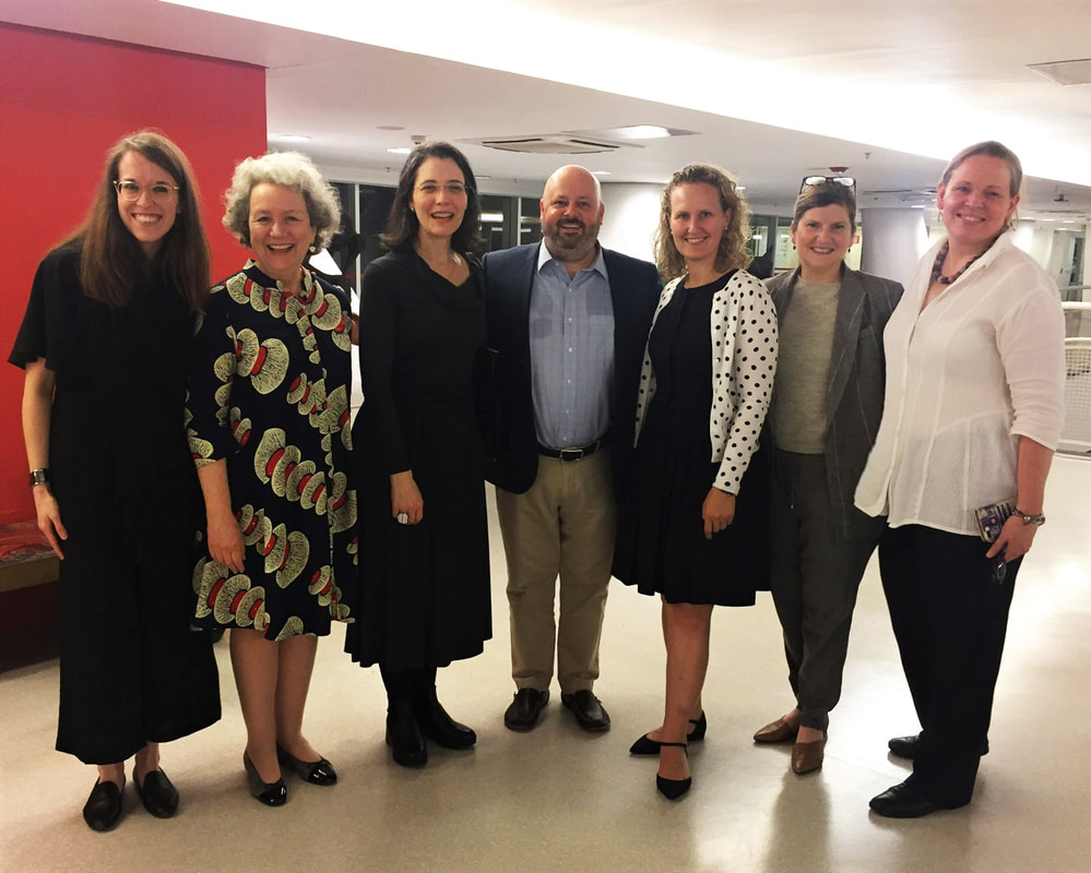 At the exhibition reception: (L-R) Taylor Poulin, Elizabeth Glassman, Ana Gonçalves Magalhães, Peter (PJ) Brownlee, Christina Weyl, Amy Zinck, and Ann Shafer. Photo by MAC USP staff.
Ann ShaferIf you know me at all, you know I spent a very long time working on a project focused on Stanley William Hayter and Atelier 17. I always talked about him as a lightning rod around whom bazillions of artists swirled. I believe his and the atelier's story is the fastest route to inserting printmaking firmly into the now-ever-changing canon. My attempt to do that in a grand fashion was not to be through circumstances out of my control, but a few smaller projects resulted. Some of the research is published in a catalogue for an exhibition at MAC USP (University of Sao Paolo). The print run was quite small, but the catalogue PDF is available here: bit.ly/Atelier17MACUSP. In addition, I was filmed talking about one of my favorite Hayter prints for the BMA, which is available here: https://www.youtube.com/watch?v=mJ6Z-8Yq9cs. I love this print. I feel like it sums up so much of Hayter's thinking and is among my top candidates for most important print of the 20th century. Stanley William Hayter (English, 1901-1988) Untitled (no. 6 from The Apocalypse), 1931 Engraving and drypoint; printed in black (intaglio) Sheet: 526 x 399 mm. (20 11/16 x 15 11/16 in.) Plate: 324 x 228 mm. (12 3/4 x 9 in.) Baltimore Museum of Art: Gift of Mr. and Mrs. Robert Paul Mann, Towson, Maryland, BMA 1979.377.6  Ann ShaferMost of you will have heard me say that the Baltimore Contemporary Print Fair (BCPF) was the most fun we had on the job. (It is seriously depressing that it likely will not happen again under the new administration.) Not only was it a deeply satisfying if exhausting event, but also we were able to use about half the proceeds for purchasing prints for the collection. I was in charge of the biennial fair three times, in 2012, 2015, and 2017, and believe me, none of them would have happened without the hard work of Ben Levy and Morgan Dowty. I owe them everything. From the 2017 fair, the museum purchased four really great prints or sets of prints by Sascha Braunig, Andrew Raftery, Ambreen Butt, and Ann Hamilton. Sometimes it takes the whole fair to decide if a print is appropriate for the collection--there's a flurry of red dotting at the last moment--and sometimes you know immediately. Such was the case with the Ann Hamilton print, RIGHTS, published by Gemini G.E.L. This is truly a print that doesn't convey in photographs, so here's a bit of description. It's a tall narrow sheet upon which is blind embossed the text of the Universal Declaration of Human Rights (UDHR), which the United Nations adopted after WWII on December 10, 1948. The letters that line up down the central spine spell out the first sentence. Blue ink was delicately daubed onto the letters forming a ghost of a figure, an everyperson. Hamilton is subtle and not so subtle at the same time. While the message of the UDHR is clearly present, it is difficult to read. It's a push-pull of quiet insistence on the righteousness of the message and screaming about the injustices around us. Yesterday I told you I never shy away from a good, political work of art, and I'm rather pleased that my last acquisition was this startling, stark, delicate, beautiful, impactful, meaningful work of art by the glorious Ann Hamilton. Ann Hamilton (American, born 1956) Published by Gemini G.E.L. RIGHTS, 2017 Blind embossment with hand-applied ink Sheet: 2019 x 546 mm. (79 1/2 x 21 ½ in.) Baltimore Museum of Art: Print, Drawing & Photograph Society Fund, with proceeds derived from the 2017 Contemporary Print Fair, BMA 2017.66    |
Ann's art blogA small corner of the interwebs to share thoughts on objects I acquired for the Baltimore Museum of Art's collection, research I've done on Stanley William Hayter and Atelier 17, experiments in intaglio printmaking, and the Baltimore Contemporary Print Fair. Archives
February 2023
Categories
All
|
||


 RSS Feed